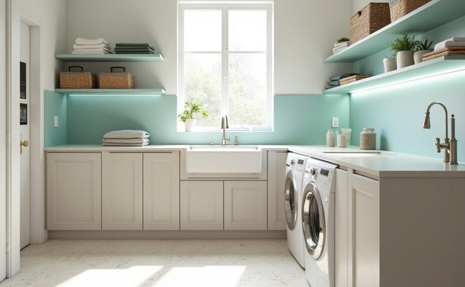
If you want a utility room that stays bright and works hard, you’ll start with high-LRV whites or light neutrals and pair them with an eggshell or satin finish that wipes clean fast. You’ll also think about wear: soft beiges, greiges, and certain pastels can hide scuffs better than stark white, especially near doors and appliances. But the “best” choice depends on your light and traffic—so what should you pick first?
Key Takeaways
- Choose bright whites or balanced off-whites to maximise light, especially in small or window-poor utility rooms.
- Use warm neutrals like greige or oatmeal (LRV 50–70) to stay bright while hiding everyday scuffs and marks.
- Consider soft pastels (dusty mint, powder blue) for freshness; they look clean yet disguise wear better than stark white.
- Pick mid-tones (denim blue, olive, smoky teal) on high-traffic walls or zones to conceal scuffs without making the room feel dark.
- Use washable finishes—eggshell for walls, satin for trim—and test swatches under LED and task lighting to avoid unwanted undertones.
How to Choose Utility Room Paint (Light, Finish, Wear)
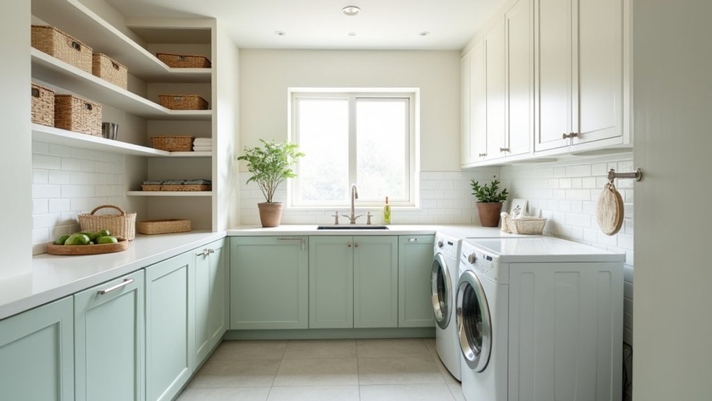
Because utility rooms do the hardest work with the least daylight, you’ll want paint that handles both lighting quirks and constant wear. Start by testing swatches at night and under task lighting; LEDs can skew undertones, so check beside cabinets and flooring.
Choose a washable finish—eggshell for softer reflection, satin for higher scrub resistance—especially near sinks, hampers, and pet zones. Prioritise durable formulations labeled scrubbable or kitchen-and-bath for moisture and detergent splash.
Prep matters: degrease, sand gloss, and spot-prime stains to prevent flashing.
For ideal paint application techniques, cut in cleanly, roll in a “W,” keep a wet edge, and apply two thin coats.
Add Decorative wall accents with a painted peg rail or tone-on-tone stripe to hide scuffs.
Best White Utility Room Paint Colours
Three qualities make a white paint work in a utility room: it needs to brighten low light, keep undertones looking clean under LEDs, and hide everyday scuffs from baskets, boots, and laundry gear.
Choose a crisp, blue-leaning white for north-facing rooms so cabinets and tile read sharp, not grey. If your space gets mixed daylight, pick a balanced, “true” white with minimal undertone to keep colour coordination simple across flooring, worktops, and appliances.
For a modern look, use the same white on walls and trim, then separate zones with sheen: eggshell on walls, satin on doors.
Finish the scheme with decorative accents—black hooks, stainless racks, and pale oak—to add contrast without dimming the room. Test swatches at night, too.
Warm Neutral Utility Room Colours (Scuff-Friendly)
Why choose warm neutrals in a utility room? They keep the space bright without the clinical feel of stark white, and they disguise everyday scuffs from baskets, boots, and laundry hampers.
Choose greige, oatmeal, or soft taupe with a mid-light value (LRV around 50–70) so it reflects light yet won’t show every mark. Specify a durable, scrubbable finish—eggshell for walls, satin for trim—so you can wipe splashes fast.
Pair warm neutrals with matte black hardware, brass hooks, or oak shelves as Decorative accents that look current.
For Storage solutions, match cabinetry to the wall colour for a seamless, calmer look, then add labelled bins in similar tones to reduce visual clutter.
Soft Pastel Utility Room Colours That Still Look Clean
A few well-chosen pastels can make your utility room feel lighter and more modern while still hiding the day-to-day mess. Choose greyed-out tones like dusty mint, powder blue, or blush-beige; they read fresh but won’t spotlight lint or water marks. Use a wipeable eggshell or satin finish so splashes clean up fast, and keep trim in crisp off-white to sharpen edges.
Balance sweetness with practical contrast: pair pastels with matte black hooks, pale oak shelves, or speckled quartz-look laminate. Add decorative accessories that earn their keep, like labeled storage bins in matching tints and a soft-toned runner.
For lighting enhancements, fit high-CRI LEDs and under-cabinet strips to prevent shadows that make corners look grimy.
Mid-Tone Utility Room Colours for High-Traffic Spaces
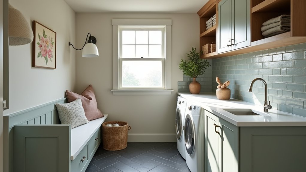
When your utility room takes daily knocks from wet coats, muddy boots, and laundry baskets, mid-tone colours give you the best balance of style and forgiveness. Think clay, warm greige, denim blue, olive, or smoky teal; they hide scuffs better than pale shades but still reflect light, especially in satin or eggshell finishes.
Keep trim and ceilings crisp white to lift the space, then build storage color coordination: match cabinetry to the wall for a seamless look, or pick a deeper tone on lower units to camouflage splashes.
For Accent wall ideas, paint the backsplash wall or the zone behind hooks in a richer shade to define drop-off areas. Pair with black hardware and natural wood for a current, hardworking feel. Add durable washable paint for easy wipe-downs.
Frequently Asked Questions
What Flooring Colour Best Complements Bright Utility Room Walls?
Choose mid-tone greige or warm light oak flooring; it balances bright walls and hides dirt. Coordinate with wall paint textures and paint finish options—matte walls, satin trim—to keep the look current, durable, and cohesive.
Do Utility Room Colours Affect How Dirty Laundry Stains Appear?
Yes—pale, polished paint makes stains pop; deeper, dusty tones disguise drips. You’ll notice Laundry stain visibility rise under cool whites. For Colour stain concealment, choose mid-tone greige, muted blue, or soft sage.
How Can I Coordinate Utility Room Paint With Appliances and Cabinets?
Match your paint to appliance undertones (stainless cool, white warm) and cabinet depth, then echo one accent color in decorative accents. Choose paint finish options—eggshell for walls, satin/semigloss for trim—for cohesive, wipeable durability.
Are There Colour Choices That Help Hide Pet Hair in Utility Rooms?
Yes—choose mid-tone greige, taupe, or soft charcoal for Pet hair camouflage; they don’t spotlight fur like white or black. Pair satin finishes with subtle speckle patterns. These stain hiding colours stay trend-forward and low-maintenance.
What Lighting Temperature Works Best With Utility Room Paint Colours?
You’ll hit the nail on the head with 3500K–4000K neutral-white Color temperature; it keeps paint true and tasks crisp. Pair dimmable Lighting fixtures and high-CRI LEDs to balance warm neutrals, cool grays, and whites.