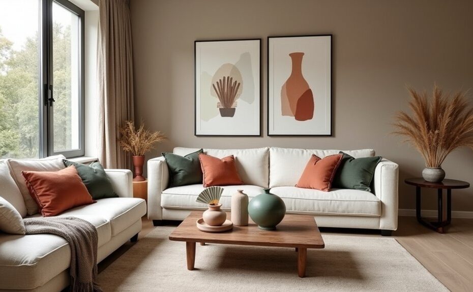
Your colour scheme is a thread, and every room you touch should stitch into the same story. You’ll get the cleanest cohesion by choosing a whole-home anchor first—either a paint family or a fixed finish—then matching undertones as lighting shifts from space to space. Pick two to three linking neutrals, balance each room with the 60-30-10 rule, and repeat key accents in textiles. Next, you’ll see why metals, woods, and sheens can make or break it…
Key Takeaways
- Choose one whole-home colour anchor (paint or fixed finish) and check it in daylight and night lighting for shifts.
- Match undertones across major surfaces; keep warm-with-warm or cool-with-cool to prevent clashing between rooms.
- Limit to 2–3 coordinating neutrals and repeat them on walls, trim, and upholstery to create a continuous visual thread.
- Apply the 60-30-10 rule: dominant base, secondary support, and a restrained accent for balanced contrast and interest.
- Repeat 2–3 accent colours and keep wood grain, metals, and sheen levels consistent to unify spaces and reduce visual noise.
Pick a Whole-Home Colour Anchor (Paint or Fixed Finishes)

If you want your rooms to feel intentionally connected, start by choosing a whole-home colour anchor—either a consistent paint family or a fixed finish you can’t (or won’t) change, like flooring, countertops, tile, or large cabinetry. Treat it as your constant, then let everything else flex around it.
Audit your home in daylight and at night to understand lighting effects: warm bulbs can yellow creams, while north light can cool grays. Use Color psychology to set the baseline mood—soft neutrals for calm, deeper hues for drama, muted greens for balance.
Pull 2–3 supporting colors from your anchor’s dominant notes, then repeat them in textiles, art, and key furnishings. You’ll get cohesion without looking matchy across every room.
Match Undertones So Your Cohesive Colour Scheme Flows
Once you’ve chosen your whole-home colour anchor, you’ll keep everything feeling seamless by matching undertones from room to room.
Start by identifying whether your key finishes and paints read warm (yellow, red, beige) or cool (blue, green, grey). Then choose supporting colours that share that same temperature.
Always compare paint undertones side by side—on large swatches and in your actual light—so “similar” colours don’t clash once they’re on the walls.
Identify Warm Vs Cool
Although two shades can look similar on a paint card, their undertones often sit on opposite sides of the warm–cool spectrum—and that’s where a cohesive colour scheme either clicks or clashes.
Start by classifying each main surface colour as warm or cool: creamy whites, beige, camel, terracotta, and brass read as warm tones; crisp whites, blue-greys, sage-leaning greens, and chrome register as cool shades.
Then commit to one temperature as your through-line, especially on large areas like walls, floors, and major upholstery.
Use the opposite temperature only as a controlled accent—think a cool marble side table in a warm room, or a tan leather ottoman in a cool one.
This keeps shifts intentional, not accidental.
Compare Paint Undertones
Because paint colour shifts under different light sources, you’ll get a more seamless, cohesive colour scheme when you compare undertones—not just the colour names or swatches. Start by placing sample cards for your wall, trim, and cabinetry colours side by side, then view them in morning, afternoon, and evening interior lighting.
Look for hidden casts: green in greige, violet in taupe, or pink in warm whites. If one chip reads muddy or suddenly “louder,” its undertone is fighting the rest. Test with larger peel-and-stick samples, and keep them on both sunny and shadowed walls.
Also factor paint finish: higher sheen can amplify undertones and reflect colour from nearby surfaces. Match undertones across adjacent rooms so gradations feel intentional, not accidental.
Choose 2–3 Neutrals That Link Every Room
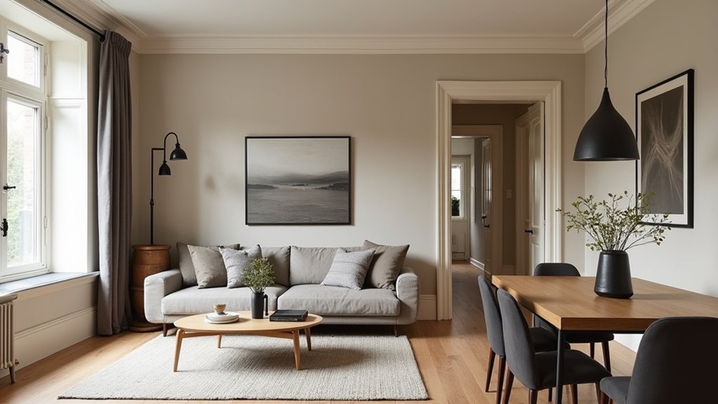
Choose a neutral base you can live with year-round—think soft white, greige, or warm taupe—as the backbone of your palette.
Then repeat those same 2–3 neutrals in every room through walls, trim, large upholstery, or key textiles so your scheme reads intentional, not piecemeal.
Keep the look current by balancing warm and cool neutrals, so each space feels cohesive without turning flat or overly beige.
Select A Neutral Base
Where do you start when every room seems to call for a different colour? Begin by selecting a neutral base that can support shifts in light, flooring, and furnishings.
Choose 2–3 neutrals with matching undertones—warm (cream, greige, taupe) or cool (soft white, dove gray, stone). Use Color psychology to guide the mood: warm neutrals read welcoming, while cool neutrals feel calm and tailored.
Test large swatches in morning and evening light, and compare them against existing fixed finishes like tile and wood. Keep sheen consistent for a modern look—matte on walls, satin on trim.
Then you can layer bolder hues as textiles or explore accent wall ideas without losing cohesion.
Repeat Neutrals Across Rooms
Once you’ve landed on a neutral base, repeat those same 2–3 neutrals across adjoining rooms to create an unbroken visual thread. Use them on consistent “anchors” like wall paint, trim, and large upholstery, then echo them in smaller doses through rugs, drapery, and art mats.
This repetition supports Color psychology by reducing visual noise and helping each space feel calm, intentional, and connected.
Make lighting considerations part of your plan: test your neutrals in morning and evening light, and view them under your actual bulbs. A greige that looks perfect in a sunlit living room can shift noticeably in a darker hall, so keep finish and sheen consistent to control reflection.
Commit to your trio, and let accents change freely.
Balance Warm And Cool
Even if you love an all-warm or all-cool look, most homes feel more cohesive when you balance both temperatures with a tight neutral mix. Choose two to three linking neutrals—like warm greige, soft ivory, and a cool stone gray—and repeat them on walls, trim, rugs, or key upholstery so sightlines flow room to room.
Use Color psychology: warmer neutrals read welcoming and grounded, while cooler ones feel calm and tailored, so your mix supports the mood you want in each zone.
Audit lighting effects before you commit: north light can sharpen cool undertones, while warm LEDs can yellow creams. Test swatches in morning and evening, then lock your “core neutrals” and build accents around them.
Apply the 60-30-10 Rule for Each Room’s Palette

Although colour trends shift from season to season, the 60-30-10 rule gives you a reliable framework for building a room palette that feels intentional and balanced. Start with 60% as your dominant colour—typically walls or large rugs—so the space reads calm and unified.
Choose 30% for secondary surfaces like upholstery, curtains, or cabinetry to add depth without visual noise. Reserve 10% for a punchy accent that sharpens the scheme and signals your style.
Use Color psychology to steer the mood: soft blues support rest, warm neutrals feel welcoming, and saturated greens read modern yet grounded.
Always test samples across the day, because lighting effects can shift undertones dramatically. If afternoon light runs warm, cool your dominant shade slightly; if it’s dim, raise contrast for clarity.
Repeat Accents and Textiles to Connect Rooms
The 60-30-10 rule gives each room a clear palette, but repeating a few accents and textiles is what makes your home feel cohesive from one space to the next. Choose two or three signature colours and echo them in small, movable pieces—pillows, throws, art mats, and ceramics—so you can edit seasonally without repainting.
Use Accent repetition with intention: repeat one pattern scale (like a bold stripe) and one solid accent (like rust or ink) across adjacent rooms, then vary the supporting tones to keep it fresh.
Lean on Textile layering to bridge styles and comfort levels. Pair a consistent weave story—linen, bouclé, or wool—with complementary patterns, and carry that mix through curtains, upholstery, and rugs for a curated, designer flow.
Use Consistent Metals, Woods, and Sheens to Unify
When you keep your metals, woods, and surface sheens consistent, you create a quiet through-line that makes different colour palettes feel intentional rather than disjointed. Pick one or two metal finishes—like brushed nickel with matte black, or aged brass alone—and repeat them across lighting, cabinet hardware, plumbing, and frames. You’ll reduce visual noise and make bolder colours read calmer.
Do the same with wood tones. Match undertones (warm honey, neutral oak, cool walnut) rather than chasing identical stains, and balance grain scale between large pieces and smaller accents.
Finally, align sheen levels: pair matte walls with satin trim, or keep everything soft-matte for a modern look. Consistency here lets your textiles and art carry the contrast without chaos.
Frequently Asked Questions
How Do I Build a Cohesive Colour Scheme With Open-Plan Layouts?
You build cohesion by choosing one base palette and repeating it across zones, using the colour wheel to balance undertones. Layer consistent accent colours in textiles and art, and shift with shared neutrals.
What’s the Best Way to Choose Colours When Lighting Varies by Room?
Test paint swatches in each room across day and night to manage Lighting variations. Choose one undertone-led palette for Color consistency, then adjust saturation, not hue. Use matte in bright rooms, satin in dimmer spaces.
How Can I Test Paint Colours Without Repainting Multiple Walls?
You can rely on peel-and-stick samples; 60% of homeowners regret rushed paint choices. Use color swatch testing on moveable boards, and pair it with digital color visualization to preview undertones across rooms before committing.
Should I Coordinate Wall Colours With Artwork, Rugs, or Furniture First?
Coordinate wall colours with your most permanent, visually dominant pieces first—usually rugs or large Furniture matching items—then refine with Artwork pairing. You’ll guarantee harmony, leverage undertones, and keep the palette current, layered, and balanced.
How Do I Transition Between Bold Colours Without Abrupt Visual Breaks?
Like a melody changing keys, you’ll shift bold colours by using gradual blending and maintaining color flow. Repeat accents, introduce mid-tone buffers, and use shared undertones across trims, textiles, and adjacent walls.