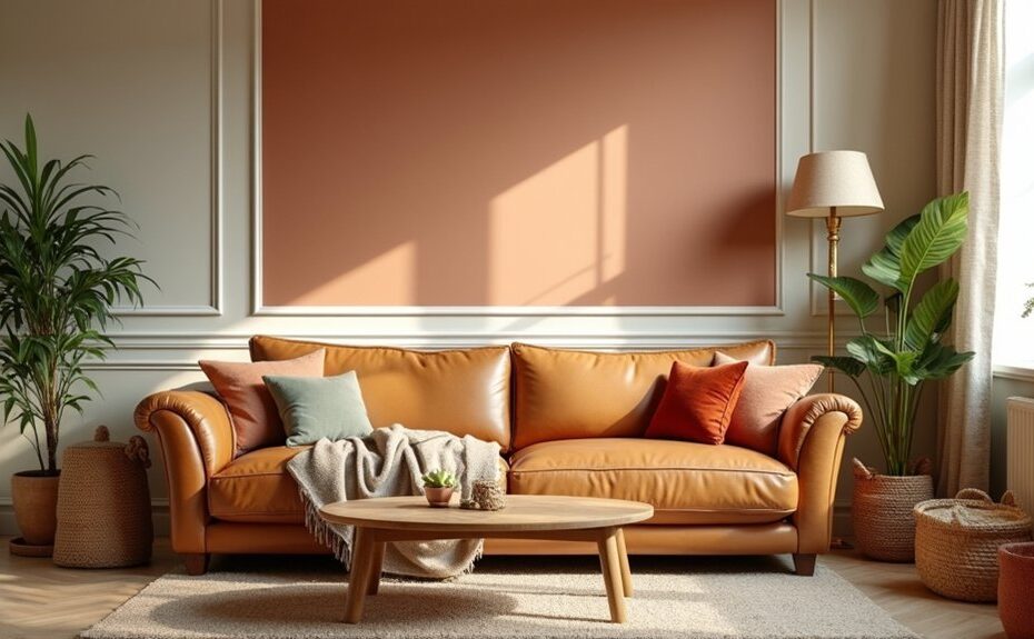
You want a living room that feels warm the moment you walk in, and colour does most of the heavy lifting. Start by noticing undertones, then build a base with creamy neutrals or warm beiges before adding depth with terracotta, soft browns, or muted greens and blues that don’t turn chilly. Pair it all with layered texture and warmer light bulbs, and the mood shifts fast—but which combination fits your space best?
Key Takeaways
- Choose warm undertones—rosy, golden, or caramel—based on the mood you want: cozy, energizing, or earthy.
- Test large paint swatches in your room’s light; north-facing rooms mute warmth, while west light intensifies it.
- Use creamy neutrals and warm beiges for an inviting base, and pair with layered textiles like linen, bouclé, and wool.
- Add earthy terracotta or cocoa-browns for grounded warmth, balancing with warm white trim to prevent heaviness.
- Try muted sage, eucalyptus, or dusty teal for calm coziness, keeping lighting warm (2700K) and using off-white trim.
Warm Living Room Colours: How to Choose Undertones
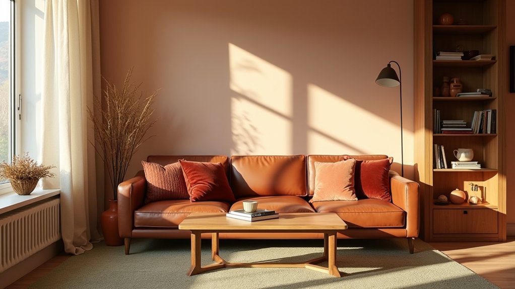
Whether you’re leaning into creamy beiges, sunbaked terracottas, or honeyed taupes, the undertone is what makes a warm living room colour feel effortlessly inviting instead of “off.” Start by deciding what kind of warmth you want: pink/red undertones read cosy and flattering, yellow undertones feel bright and optimistic, and orange/brown undertones deliver that grounded, design-forward warmth you see in current earthy palettes.
Then test in your actual light: north-facing rooms mute warmth, while west light amplifies it. Use a white sheet of paper to spot shifts toward pink, gold, or caramel.
Let color psychology guide function—rosier tones encourage connection, golden tones energize, and clay-browns calm. Finally, respect cultural influences: what reads “warm” varies, so match undertones to your home’s art, textiles, and rituals.
Creamy Neutrals and Beiges for Cozy Rooms
Why do creamy neutrals and beiges make a living room feel instantly more livable? In Color psychology, these hues signal safety and softness, so you’ll relax faster and your space reads calm, not cold.
Choose a beige with a gentle cream base to flatter skin tones and make textiles look richer, especially in north-facing light.
To keep it current, pair warm beige walls with matte black accents, light oak, and layered bouclé or linen. You’ll get that boutique-hotel glow without feeling staged.
Use smart paint application techniques: cut in clean lines, then roll in a “W” pattern to avoid lap marks. Finish with a low-sheen eggshell for wipeability and subtle depth.
If you’re unsure, test large swatches and view them day-to-night.
Earthy Terracotta and Browns for Warmth
Because they echo sunbaked clay and aged wood, terracotta and warm browns instantly ground your living room and make it feel inviting rather than overly styled. Use Color psychology to your advantage: terracotta reads sociable and comforting, while cocoa and chestnut tones signal stability and refuge after a long day.
Keep it current by pairing these hues with textured linens, matte black accents, and natural oak. If you’ve got limited light, choose a softened terracotta or a caramel brown to avoid heaviness, then lift the room with warm whites on trim.
Explore paint finish options based on traffic: eggshell hides minor scuffs on walls, matte looks velvety for a feature wall, and satin works best on doors and built-ins.
Muted Greens and Blues That Still Feel Cozy
Although greens and blues sit on the cooler side of the spectrum, muted versions—think sage, eucalyptus, dusty teal, and stormy slate—still wrap your living room in a calm, lived-in coziness. You’ll get that modern, heritage-inspired look designers keep specifying, without the starkness of bright jewel tones.
Lean into Complementary color schemes by pairing sage with clay, dusty teal with soft blush, or slate with warm sand, so the room feels balanced and inviting.
For quick, high-impact updates, use Accent wall ideas: paint the fireplace surround in stormy slate, take eucalyptus behind built-ins, or frame your sofa in dusty teal to define the seating zone.
Keep trim a creamy off-white, and you’ll maintain warmth while the color stays sophisticated, relaxed, and easy to live with.
Lighting and Texture to Warm Up Any Palette
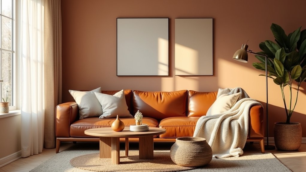
Even if you’ve chosen a cool, modern wall colour, the right lighting and layered texture can make it feel instantly warmer and more welcoming. Swap harsh overheads for dimmable lamps and wall sconces, and pick warm LEDs (around 2700K) to soften edges and flatter skin tones. Add a statement pendant with a fabric shade to cast a cozy glow.
Then build depth with touchable finishes: a wool rug, bouclé cushions, linen drapery, and a matte-wood coffee table. Mix in metal thoughtfully—brushed brass reads warmer than chrome—so your Modern decor accents feel intentional, not cold.
If you want quick impact, use Accent wall ideas like slatted wood panels, limewash, or textured wallpaper behind the sofa. Your palette stays modern; your room feels inviting.
Frequently Asked Questions
What Paint Finish Is Best for High-Traffic Living Rooms?
Choose eggshell or satin for high-traffic living rooms; you’ll get washable walls with a soft, modern glow. Among paint sheen options, they balance style and scuff resistance, maximizing durability of finishes without highlighting imperfections.
How Often Should Living Room Walls Be Repainted to Stay Fresh?
You’ll typically repaint living room walls every 5–7 years—but wait, your space may whisper sooner. Follow a wall repainting schedule: touch up yearly, plan a living room colour refresh frequency at 3–5 if scuffs show.
Are Warm Colours Suitable for Open-Plan Spaces With a Kitchen?
Yes, you can use warm colours in an open-plan space with a kitchen if you manage open plan space coordination and keep warm colour palette balance. Choose cohesive undertones, repeat accents, and anchor zones with cabinetry.
How Can I Make Warm Colours Work With Grey Flooring?
Pair warm wall tones with grey flooring using complementary colour schemes like terracotta and sage. Layer texture and material choices—oak, boucle, brass accents—to soften cool undertones. Keep trims crisp, add warm lighting, balance saturation.
Which Warm Paint Colours Help Hide Scuffs and Fingerprints?
You’ll hide scuffs and fingerprints with warm mid-tone greiges, camel tans, clay terracottas, and muted olives in eggshell or matte. Choose Fingerprint resistant paints and Scuff hiding wall finishes for stylish, low-maintenance, on-trend rooms.