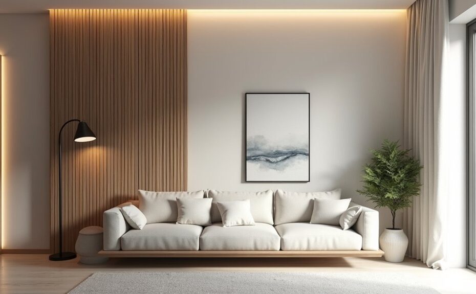
A feature wall can make a room feel larger, not louder, if you treat it like a focal point instead of a flex. You’ll start by choosing the right wall and setting a palette that supports it, then you’ll dial in contrast, scale, and texture so the statement stays controlled. Keep furniture placement and décor intentionally quiet, and use lighting to sharpen the effect. The key move most people miss is…
Key Takeaways
- Choose a single prominent wall with minimal doors or windows, so the feature reads intentional and doesn’t compete with visual clutter.
- Build the feature color from existing room elements, using two to three supporting hues and matching warm/cool undertones to finishes.
- Control contrast to suit the mood: low-contrast tones feel calm, while high-contrast schemes need more surrounding neutrals to balance.
- Keep pattern and texture proportional to the room size, using layered materials like limewash or paneling for depth without busyness.
- Use layered, dimmable lighting and minimal décor, letting a few well-scaled pieces and consistent materials reinforce the wall without overstyling.
Choose the Right Wall for a Feature Wall
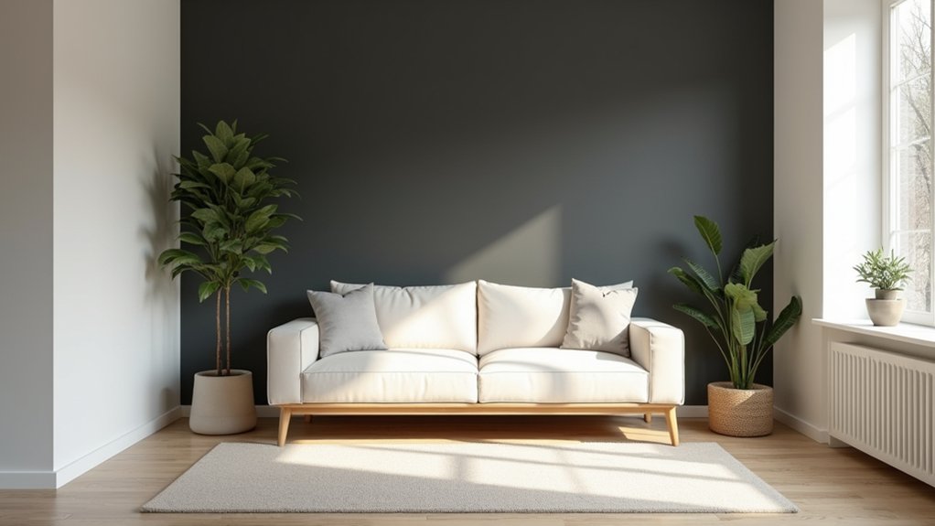
Where should your feature wall go so it looks intentional, not random? Pick the wall your eyes land on first: behind the sofa, bed, or dining table, or the fireplace wall. You’ll get a built-in focal point without forcing one.
Avoid walls chopped up by too many doors or tiny windows, since breaks dilute impact. If you have an open plan, choose a wall that helps zone the space rather than compete with multiple sightlines.
Consider light: strong daylight shows texture and sheen, while dim corners can flatten bold choices.
Match Wall materials to the room’s architecture—brick suits industrial, slatted wood fits warm modern, and plaster works in minimalist spaces.
Check Color coordination with nearby large pieces so the wall reads cohesive.
Set a Palette That Supports the Feature Wall
Once you’ve picked the wall, build a palette that frames it rather than fights it. Start by sampling what’s already in the room: flooring undertones, major upholstery, and the largest rug. Pull two to three supporting hues from those elements so your feature wall feels intentional, not isolated.
Aim for Color harmony by assigning roles: one dominant neutral, one supporting midtone, and one accent used sparingly in textiles or art. Keep finishes consistent—warm metals with warm colors, cool chrome with cooler shades—to avoid visual noise.
For mood enhancement, decide the emotional direction first: calm (soft clay, oatmeal, muted sage) or energized (inky blue with crisp white and a citrus accent). Use paint swatches in morning and evening light to confirm everything stays cohesive.
Pick a Feature Wall Color With the Right Contrast
How bold should your feature wall feel in the room? Start by judging the existing light and finishes: bright spaces can handle deeper hues, while low-light rooms often need mid-tones to stay inviting.
Aim for Color harmony by pulling one shade from your rug, art, or upholstery, then shifting it darker or lighter for controlled emphasis. Use contrast techniques that fit the mood: high contrast (charcoal against warm white) reads modern and crisp; low contrast (clay on beige) feels calm and elevated.
Check undertones, too—pair warm paints with warm woods and metals, cool paints with stone and chrome. Before committing, paint a large sample and view it morning, afternoon, and night.
Balance Feature Wall Pattern and Scale
After you’ve nailed the right contrast, make sure the pattern and scale of your feature wall match the room’s proportions instead of fighting them. In a small bedroom, choose tighter repeats like subtle stripes or mini geometrics so the wall reads intentional, not busy.
In a large living room, you can step up to oversized botanicals or bold murals, but keep scale proportion in check by giving the pattern breathing room with simpler adjacent walls.
Aim for pattern harmony by echoing shapes already in the space—arched mirrors, rounded chairs, or angular shelving. If your furniture has strong lines, pick a softer motif; if the room’s minimal, a graphic repeat adds energy.
Test with a sample at viewing distance, not just close up.
Add Depth With Texture and Sheen
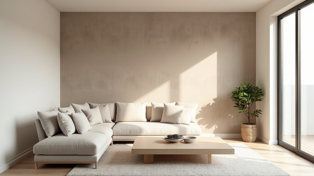
You can add instant dimension to your feature wall by layering textures—think grasscloth over subtle paneling or a limewash finish that keeps the look refined.
Balance matte and gloss by pairing a soft, flat base with targeted sheen on trim, geometric accents, or a clear coat to catch the eye without overpowering the room.
Choose light-responsive surfaces based on your lighting plan, since raking daylight and warm evening lamps will highlight texture and shift sheen throughout the day.
Layered Textures For Subtlety
While bold colors grab attention fast, layered textures create a more sophisticated feature wall by building depth through touch and light. Start with one quiet base—painted drywall, plaster, or limewash—then introduce subtle layering in controlled bands or panels. You’ll get textural contrast without visual noise when you mix a smooth field with a lightly raised element, like narrow battens, ribbed wallpaper, or a thin microcement skim.
Keep the palette restrained so texture does the work: warm whites, softened taupes, and clay neutrals read current and calming. Vary scale, not color—pair fine grain (linen, grasscloth) with broader relief (slatted wood, fluted MDF). Test samples under day and lamp light, and step back often; if the surface feels busy from across the room, simplify one layer.
Balancing Matte And Gloss
Because sheen changes how light moves across a surface, balancing matte and gloss instantly adds dimension to a feature wall without introducing more color. Start with a primarily matte base so the wall feels calm and architectural, then layer controlled gloss in specific zones for crisp definition.
Use satin or semi-gloss on trim, panel molding, or a painted geometric band to create clean edges and intentional breaks. Pair a flat paint with a subtle gloss clear coat through a stencil to build textural contrast while keeping the palette restrained.
If you’re using wallpaper, choose a matte ground with gloss-ink detailing so pattern reads sophisticated, not busy. Keep the sheen shift consistent—repeat it at two or three heights—so surface reflection looks designed, not accidental.
Light-Responsive Surface Choices
Even a single-color feature wall can look layered once the finish responds to shifting daylight and evening lamps. Choose surfaces that catch highlights without turning flashy: eggshell, soft satin, or a limewash that blooms as ambient illumination changes.
If your room faces north, add warmth with a velvety paint or micro-cement skim that reads richer in low light. In bright, south-facing spaces, keep sheen controlled and let texture do the work.
Work in natural materials for depth that feels calm: rift-sawn oak slats, cork panels, clay plaster, or grasscloth with a tight weave. Pair them with directional sconces or a picture light to rake across the surface, emphasizing relief while keeping the color field consistent and quiet.
Place Furniture to Balance the Feature Wall
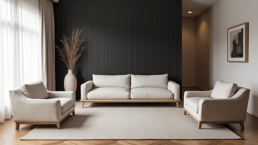
Place your main seating opposite the feature wall to create a clear focal line and keep the room feeling intentional.
Then float lighter pieces—like a console, accent chair, or nesting tables—slightly off the wall so circulation stays smooth and the layout feels current.
As you adjust spacing, aim for visual balance rather than perfect symmetry, letting negative space frame the wall instead of competing with it.
Anchor Seating Opposite
If your feature wall steals the spotlight, anchor your main seating directly opposite it to keep the room feeling intentional and balanced. Center the sofa on the wall’s midpoint, then align side chairs so the sightline lands where you want it, not on clutter.
This seating arrangement creates a visual “pause” that lets bold paint, texture, or pattern read as curated instead of loud.
Fine-tune wall art placement by matching the sofa’s width to the art grouping’s overall span, or slightly undersizing it for a modern, gallery-like margin.
Keep coffee-table and rug proportions generous so the conversation zone feels grounded.
If the wall includes a fireplace or media unit, aim your seating to it first, then let the feature finish the composition.
Float Pieces For Flow
When your feature wall feels visually heavy, floating a few key pieces pulls the room into better flow and keeps the layout from reading as “furniture pushed to the edges.” Slide the sofa or a pair of lounge chairs a few inches off the wall, then use a rug to define that conversation zone and a slim console behind seating to add function without blocking circulation.
Keep sightlines clean by floating one accent chair near the feature wall instead of adding bulk. If you’re using Floating shelves, shift a side table or ottoman toward the room’s center to visually “catch” that vertical weight.
Balance wall mounted art with a low, airy media unit or a narrow bench that doesn’t compete. Finish with a floor lamp and a small plant to soften edges and guide movement.
Finish the Feature Wall With Lighting and Décor
Although the wall itself sets the tone, lighting and décor are what make your feature wall feel intentional and lived-in. Start with ambient lighting that layers, not blasts: a dimmable sconce pair, a slim picture light over art, or an LED strip tucked behind a floating shelf to add depth and soften contrast at night.
Then edit your decorative accessories like you’d style a coffee table—fewer, better pieces. Anchor the vignette with one sculptural object, add a stack of books or a low bowl for scale, and repeat one material (brass, blackened steel, oak) to keep it cohesive. Leave negative space so the wall can breathe.
If you’ve used bold color or pattern, choose quieter décor; if the wall’s subtle, go richer with texture.
Frequently Asked Questions
How Much Does a DIY Feature Wall Typically Cost?
You’ll typically spend $50–$500 on a DIY feature wall; it’s like dressing a room in a statement jacket. Cost considerations include materials, tools, and prep. Choose budget friendly ideas like paint, peel-and-stick, or wood slats.
Can Renters Create a Feature Wall Without Damaging Paint or Drywall?
Yes—you can create a renter-friendly feature wall without damage if you use Temporary adhesives and choose Non permanent panels. Stick to peel-and-stick wallpaper, Command strips, or lightweight slats, and test a small area first.
How Do I Remove a Feature Wall Treatment Later Without Major Repairs?
You’ll remove it cleanly by using heat or steam, then peel slowly and scrape with a plastic tool; prioritize damage prevention. Patch nail holes, sand lightly, and prime. Follow removal techniques for wallpaper, panels, decals.
What Feature Wall Options Work Best in Humid Bathrooms or Kitchens?
You’ll get the best results with Tile patterns in porcelain or ceramic, plus Waterproof materials like PVC panels, sealed microcement, or glass. Choose mildew-resistant grout, ventilate well, and use marine-grade paint for accent sections.
Should the Feature Wall Match the Home’s Exterior or Overall Style?
Yes—you should treat it like a bridge between indoors and out. Aim for Exterior harmony without copying the facade. Use Style coordination through shared colors, textures, or motifs, and you’ll keep it current, cohesive.