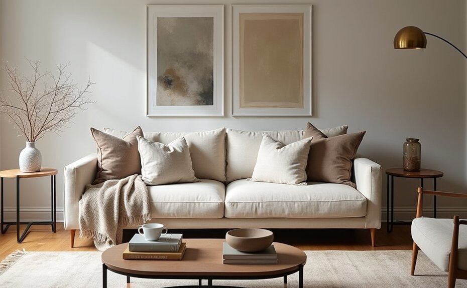
Think of your room like a stage—every piece needs a role. You start by locking in a focal point, then you plan the layout so movement feels natural and conversation lands easily. You tighten the look with a three-color palette, layer lighting for soft glow and crisp highlights, and mix textures so the space feels rich, not busy. And once you apply the Rule of Three, everything snaps into place… but there’s one detail you can’t skip.
Key Takeaways
- Choose a strong focal point and aim seating toward it, keeping the area around it uncluttered for a deliberate, designer look.
- Plan furniture layout for flow: float key pieces, create conversation zones, and maintain 30–36 inch walkways from doors to main areas.
- Build a tight three-color palette: dominant base, supportive mid-tone, and a sharp accent repeated in small decor for cohesion.
- Layer lighting with separate controls: dimmable ambient overhead, focused task lamps, and accent lights to add depth and mood.
- Mix textures and finishes, then style surfaces using the rule of three, varying heights and materials while leaving intentional negative space.
Choose a Focal Point and Plan the Layout
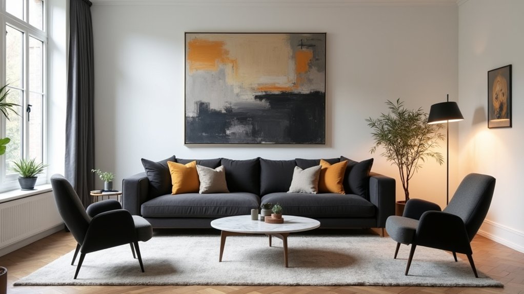
Where should your eye land the moment you walk in? Pick one anchor—fireplace, picture window, statement art, or the bed’s headboard—and commit. Keep Focal point placement on the strongest wall, then clear visual noise around it so it reads crisp and intentional.
Angle seating toward that anchor, not the TV by default, and set a tight conversation distance so the room feels edited.
Map Layout flow next: draw straight paths from doorways to key zones, then float furniture to protect them. Leave 30–36 inches for main walkways, 18 inches from sofa to coffee table, and balance tall pieces across the room for even weight.
Test sightlines while standing and sitting.
Build a 3-Color Palette for Room Styling
Once your focal point and layout lock in, color becomes the tool that makes everything feel intentional rather than accidental. Build a three-color palette: a dominant base, a supporting mid-tone, and a sharp accent.
Start with your largest surface—walls or a rug—as the base; choose a grounded neutral or soft hue that won’t fight your furnishings. Add the mid-tone through upholstery and drapery to create Color harmony with your base.
Then pick one accent that delivers palette contrast—think inky navy, brass, or terracotta—and repeat it in two to three small hits (pillows, art, a vase) so it reads as deliberate. Keep undertones consistent, and test swatches in the room’s shadows before committing.
Layer Lighting to Style a Room With Mood
Even if your color palette feels dialed in, flat lighting can make the room read lifeless, so you’ll want to layer light the way a designer does: in tiers. Start with overhead or a ceiling fixture on a dimmer to establish an ambient glow that’s even and soft.
Next, add task light where you work: a reading lamp by the sofa, pendants over a desk, under-cabinet strips in the kitchen. Aim bulbs toward surfaces, not eyes, and keep color temperature consistent (2700–3000K for cozy rooms).
Finish with lighting accents that sculpt the space: a picture light over art, a small uplight behind a plant, or LED tape tucked on a shelf. Put each tier on separate switches so you can shift mood instantly.
Mix Textures and Finishes for a Designer Look
If your room looks “finished” on paper but still feels flat in real life, texture is the missing dimension. Build Textural contrasts by pairing plush with crisp: boucle chair against a tailored linen sofa, a nubby wool rug under sleek casegoods, or raw timber beside polished stone. Keep your palette tight so the surfaces do the talking.
Then refine with Finish combinations that catch light differently. Mix matte walls with satin trim, brushed brass with blackened steel, and ribbed glass with glazed ceramic. Repeat each finish at least twice so it reads intentional, not random.
Add one “bridge” material—like warm oak or cognac leather—to connect cool metals and bright whites. Finally, vary scale: wide-weave textiles, fine-grain wood, and subtly hammered metal create depth without clutter.
Style Shelves and Tables With the “Rule of Three”
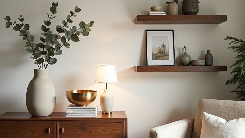
Because shelves and tabletops read like tiny stage sets, you’ll get a more polished look by grouping decor in threes: one tall, one medium, one small. Anchor the trio with height—a lamp, vase, or framed print—then layer in a mid-scale object like a bowl or box, and finish with a small sculptural piece.
Vary materials for contrast: matte ceramic, warm wood, and a touch of metal. Keep each group tight, with overlaps and staggered edges, so it reads intentional, not scattered. Leave negative space to let the eye rest.
If you love symmetrical arrangements, mirror the *type* of trio on both sides, but change colors or textures to avoid stiffness. Skip overly shiny artificial accessories; choose lifelike stems or textured faux pieces.
Frequently Asked Questions
How Do I Style a Room on a Tight Budget Without Looking Cheap?
You’ll style a room on a tight budget by prioritizing Budget decor: edit clutter, choose a cohesive palette, add layered lighting, and upgrade hardware. Use DIY upgrades like paint, thrifted frames, and tailored textiles for polish.
What Are the Best Paint Sheens for Walls, Trim, and Ceilings?
You’ll want eggshell or satin on walls, semi-gloss on trim, and flat matte on ceilings. These sheens sharpen color combinations, balance glare, and highlight texture options. Use washable satin in busy rooms, matte in calm spaces.
How Can I Make a Small Room Feel Larger Without Removing Furniture?
You’ll make a small room feel larger by using Color illusions—light, cool paints and consistent tones—plus strategic furniture placement: float pieces, expose legs, clear pathways, hang curtains high, and add a large mirror.
Which Window Treatments Look Most High-End and Are Easy to Maintain?
You’ll get the most high-end, low-maintenance look with tailored linen-blend drapery, lined roller shades, or woven wood shades. Choose luxury fabric in neutral tones, hang high, and use sleek hardware for crisp, polished lines.
How Do I Choose Artwork Size and Height for Proper Wall Placement?
Like a well-tailored jacket, choose art that fits. Center artwork placement at 57–60 inches to midline. Hang 6–8 inches above furniture, size to 2/3 width, and keep wall spacing 2–3 inches.